CGI Foundations
Intro to CGI Foundations Report
Fable Report Essay
The game Fable has been around since 2004, while it not being very influential in the industry in terms of Visual Effects (VFX) it is still a very rich and atmospheric. It spawned an expansion (Fable: The Lost Chapters, 2005), a remaster (Fable Anniversary, 2014), two direct sequels (Fable II, 2008; Fable III, 2010) and various spin offs. Each sequel improving substantially the VFX elements like lightning and spells.
Fable is a fantasy RPG (Role Playing Game) with real time combat, it is set on the fictional land of Albion where the player takes control of a Hero protagonist who can use various combat styles. The combat styles consist of melee, skill (ranged) and will (magic), with will style being the use of magic during combat. Fable has a wide variety of magic spells and as such a wide variety of visual effects for each of them, including large scale effects which could occupy a large portion of the screen and real time rendering these effects was no small feat for a game released in 2004.
The term visual effects (VFX) is used to describe any imagery created, enhanced or manipulated for any type of visual media that does not physically exist in the real world. In the case of a film any visual elements added over the footage taken in live action can be described as VFX, a notable example would be beam of a lightsaber in Star Wars (1977). VFX allows us to create creatures, environments, and objects, although this VFX has been pioneered by the film industry it has been adopted in the video game industry and evolved greatly with it (Francisco, 2020).
As video game engines process three dimensional data to produce in real time dynamic images, it has greatly benefited the film industry. Some scenes of films can be built in game engines and have for example lighting settings prepared and adjusted to best fit the scene making the process of preparing a scene for real time shooting more efficient and quicker (Francisco, 2020).
In video games, game designers are able to simulate numerous real life experiences, in this manner there are virtually unlimited visual effects that can created for games (Yang, Yip, & Xu, 2009).
Fable is very rich in visual effects as they serve more than just to make the game look good. VFX are used as cues as well. When in melee combat if the player is using their weapon to defend, once an opponent strikes, there are visual particles from metal clashing indicating the defence was successful, there is also a visual effect of the weapon swing and an effect when the weapon successfully damages the enemy.
Some other visual effects Fable also has, is dynamic lightning and shadows, these are mainly affected by the in game time of the day as this game has a day and night cycle. Depending on the time of day the in game lightning source would change position and tint in real time, this then would also affect the shadows cast by players, non player characters and some of the assets in the environment. All the lightning and shadow effects really make the game atmospheric while also giving the player a sense of passage of time.
Perhaps one of the biggest things that the game provided, as it was something that had been done before was Character Morphing. This is a rather different concept than character customisation. The idea behind it is that the player character undergoes visual changes throughout the game.
There is quite a lot of factors that affect how the player character would looks like. The most unpopular being the character visually aging as players use their experience points by buying skills and skills levels as well as investing points in specific skill trees.
Investing on skills of the melee combat tree would make the character more muscular, buying points on the skill (ranged) combat would make the character taller and points in the will tree would make the character’s hair turn white faster and eventually bright blue “will lines” would start showing up on their body.
The character also morphs according to moral alignment, on a good alignment the character’s hair gets a lighter in colour and a glowing halo with fluttering butterflies starts showing over the player character’s head. Meanwhile on evil alignment the player character’s hair gets darker, starts balding on top of the head, certain parts of the skin start cracking, horns start to grow on the player character’s forehead, the eyes get darker and gain a red glow.
Other visual morphing present in the game would be battle scaring, if the player character is damaged there is a chance that will leave a permanent scar, which would appear very bold if was a recent scar and would fade slightly over time.
All the visual morphing the character undergoes through the game happens gradually, so there are various stages and opacities in the process.
It is fair to say that Fable and consequent sequels created this formula of character morphing never seen before in games, and all stages of the morphing being visible to the player as they play the game. It might have not created a big impact on the industry itself however it created a very lasting impression on the player base.
Character morphing is a huge deal and all part of the capabilities of how visual effects can really affect the player experience, not just fancy lighting, and spell effects. Although these effects during combat do also play a big part in that experience, to quote Dane and Simon Carter: “Every single attack must be covered up with so many big bastard sparkly, spangly effects that the player is too busy having an epileptic fit to see anything else, leaving you free to ignore all the other rules.” (2003). Even though they were commenting on the difficulty of making real time combat, the quote seems relevant as to how combat visual effects can be impactful on player experience.
Fable really played a lot with visuals to make something that people today still remember, and some remember it as better than what it actually looked like at the time. The visuals effects were well crafted with emphasis on the player character morphing. It made a much more relevant impact on the player base than the industry itself making it still a special game like no other that players are likely to come back to as the way they play the game will have direct visual representation on their the character they are playing.
References
Carter, D. and Carter, S. (2003) Fable Developer Diary #11 Fighting. Available at: https://web.archive.org/web/20100102112823/http://lionhead.com/Fable/fable_devdiary_11.aspx (Accessed: 31 March 2022)
Fable (2004). Microsoft Windows [Game]. Microsoft Game Studios.
Fable Anniversary (2014). Xbox 360 [Game]. Microsoft Studios
Fable: The Lost Chapters (2005). Microsoft Windows [Game]. Microsoft Game Studios.
Fable II (2008). Xbox 360 [Game]. Microsoft Game Studios.
Fable III (2010). Xbox 360 [Game]. Microsoft Game Studios
Francisco, E. (2020) Video Games are getting Hollywood VFX to level up. Available at: https://www.inverse.com/entertainment/hollywoods-greatest-vfx-tool-in-the-2020s-video-games (Accessed: 27 March 2022)
Star Wars (1977) Directed by George Lucas [Film]. 20th Century Fox.
Yang, X., Yip, M. and Xu, X., 2009. Visual effects in computer games. Computer, 42(7), pp.48-56.
Developing a scene
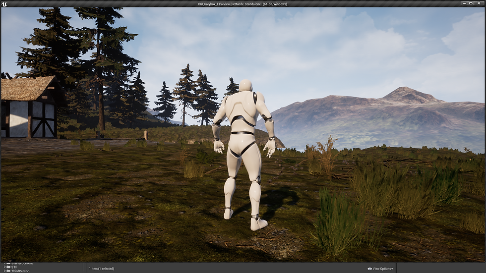
In this module we had to develop a scene and greybox it on unreal.
I thought about doing a medieval village in a forest setting, so I googled some images.
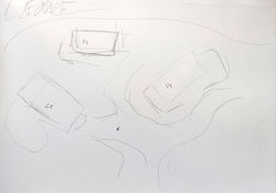
Then I set up a mood board and roughly sketched what I would like my scene to look like.
 MoodBoard |
|---|
 |  |
|---|
Scene Greybox pt1
In Unreal Engine for the greybox I used the landscape mode to make the plane and lightly sculpted it.
By using Unreal's basic shapes and merging them together I made basic effigies for the scene, such as the chapel looking building, houses and trees.
After getting a tree effigy done I used the foliage tool to spread it around the landscape.
 |
|---|
Landscape and Materials
During week 5 we set up a Landscape and a material using 3 textures from starter content to paint the landscape. On material blueprint we added texture cords to adjust the size of the texture on the material so it would not look as tiled. We then created another material, metallic and added constants to adjust material settings, such as metallic and specular settings.
 |  |  |
|---|---|---|
 |  |
Substance Painter Workshop (Week 6)
For week 6 we had a workshop to work with substance painter.
First of we learned how to bake textures maps.
Basically we had a high poly and low poly model of an oil can. The process involved using Substance painter to grab the normals from the high poly model into the low poly mesh. As working with high poly models could give performance issues, specially in games that we play with real time rendering.
Afterwards we used a process of smart masking to paint the model, by selecting which faces would be affected by the mask. Then applying paint and textures under this mask so it would only affect the selected faces.
We created masks for different parts of the model, the barrel, caps, metal parts and the strap.
Afterwards we got an image from the internet to make a decal. I searched for a biohazard sign. On photoshop we adjusted the image size and created an alpha to then add to substance painter as a brush.
(Decal Image Source: https://www.seton.co.uk/biohazard-symbol-vinyl-safety-labels-on-a-roll.html#303FYD000)
We also added some blemishes, such as rust and sun damage to the model, played with some artificial lighting and rendered the result inside substance painter.
 Low Poly mesh before Baking |  After Baking |
|---|
 |
|---|
 |
 |
|---|
 |  |
|---|
Scene Greybox pt2
I modified the terrain and adjusted the tree foliage so it would not appear as floating.
Afterwards I sculped the terrain to add a river to the scene and made a platform using the basic geometry available in unreal.
Then I created a plane and used the water texture from the starter pack content to make the water part of the river.
lastly I modified the lighting position, the strength and tint. I also added some fog and played a bit with the settings.
 |
|---|
 |
 |
Lighting and Reflection (Week 7)
During this lecture we got to know more about lightning, how it impacts the environment and how reflective materials react to lightning conditions. As well as how to use reflection captures appropriately.
For this we started by making a material on Unreal and adjusting it's properties to turn it into a super reflective material. Then we added different types of lighting, adjusted lightning details and "built" the lights. Also changing between different types of reflection captures to see how the reflections would change.
I added more geometric shapes and gave them other type of reflective materials, also added different types of light of different colours. I eventually closed the area as I wanted to see the effects on an indoor type of setting.
To test Planar reflections I put a mirror like plane on my scene and added the planar reflection capture, although it was not perfect it was able to detect elements that were not directly in sight of the third person camera view.
Afterwards I made another scene with limited lighting and made emissive materials as they "glow" to see how it would it would impact the world.


Architectural Visualisation (Week 8)
For the workshop aspect of this week's lecture, as a group we had to make an asset list that we would need for a specific building/scene.
The make of the building is very simple in structure but the challenge was to identify some of the materials, as the building in the scene was a renovated old building that was turned into an artists studio.
Notes/Observations/List:
Old building renovated into a studio
Surrounding area is a Tundra, remote, grassy lands
The outer top part is new white metal painted corrugated sheets
The top roof “windows” have a black metal frame
White drainage pipes
Roof cooling pipes
The windows are a simple wooden light-coloured frame
Old parts of the building have a mixture of materials, the older parts are really rough and have a rusty aspect to them on the outer part of the wall
Some newer concrete and cement parts can be seen on the walls of the bottom part of the main building as well as hinds of old paint
Garden area has small half walls of mixed coloured rocks, mainly rectangular odd shaped and grassy
From the outside it can be seen some flowerpots and big light bulbs.
 Hlöðuberg Artist Studio / Studio Bua |  |
|---|
Particle Effects (Week 10)
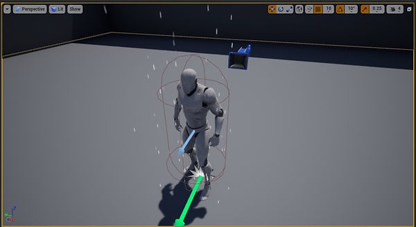
For week 10 we learned about particle effects and in the workshop session we made a rain particle system in Unreal using Cascade.
I used the provided worksheet and the help of the unreal documentation.
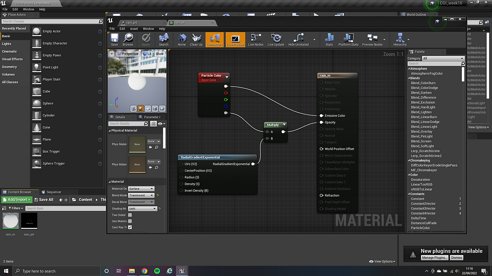
First I created a new material, unlit and translucent, added particle color, a radial gradient exponential and a multiply node then plugged the notes.
After, I created a new particle system and changed the default material to the material I had just created.
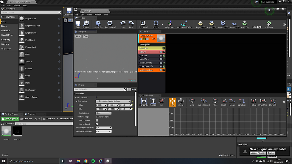
Then changed the settings to make the particle emitter to render from the GPU, added and changed some of the settings, such as Initial Velocity, Initial Size, Lifetime, spawn detail and Initial Location.
I also adjusted the size of the particles by speed and changed the Particle emitter orientation to lock on the axis and rotate with the Z axis.
For personal preference I decided to increase the amount of particles on screen, to get a more heavier rain feel, also adjusted the starting position as it was not covering the entire area of the example map.
Although not required but to add a wind affect I changed the constant acceleration and changed screen alignment to PSA velocity to give the effect of the rain fall in an angle.
After following all the instructions of the worksheet I decided to check the settings of particle effects of the starter content of unreal, and change them to see the effects, I also attempted to make a new particle system using the same material but with different settings.
Instead of rain falling down I made the particles travel slower and upwards, from a smaller starting position.
_edited.jpg)


_edited.jpg)
Post Processing In Unreal (Week 11)
During this week we got to learn about post processing volumes, how they apply to the camera view and not the scene. Quite a lot can be adjusted using post process such as making specific areas appear foggy, dark, giving a vignette to the camera view without having to add certain elements to the scene which is a good way to reduce the impact on performance but still have incredible visuals and effects.


For another module I actually used post processing volumes to affect the colour temperature as well as added a thick fog to one of the eras. That fog was set so it would not affect the immediate surroundings of the player character's viewport and impairing visually how far the player could see.
For this I followed a tutorial on YouTube to guide me and adjusted the view distances on the material to match my preferences.


Reference Images
A2 - Medieval Bucket
Since my scene was medieval themed I decided to make a medieval bucket.
I started by using google for some reference images.


Then I modelled a low poly bucket and a higher poly version with some smoother surfaces, like the bucket's metal handle.
After modelling the bucket I manually adjusted the UV maps before importing the mesh into Substance Painter.
On Substance painter I baked the textures from the High poly version of the bucket model into the low poly version.
Then I set black masks for the different parts of the bucket. For the textures I used substance's starter pack content.


Plugins and Advanced Techniques (Week 12)
For this week we got to know more about unreal plugins and other CGI techniques used.
Also some free to use apps that can be used for projects in unreal.
As part of the workshop aspect I was given a green screen image sequence of a puppy, the activity was to put this sequence moving in an unreal test scene.
In order to make the image move and remove the green screen, I set up a sequence, and made a material with a blend mode set to masked. On a material instance of that material under details I set the green colour and adjusted it to try and take most of the green out of the image.


Outside of the lecture I decided to give a try to one of the free tools mentioned during the lecture.
Face Motion 3D is an app for iOS that captures facial movement, since i have an iOS decide I decided to give it a try. The free usage is limited but it exports as an .obj and .wav files. The .obj file was easily imported into Maya.
I personally did not work much with this export as my knowledge of animation is still very limited but found it interesting to try in future projects.
Face Motion 3D - https://www.facemotion3d.info/
While on iOS I also found Polycam, it uses the iPhone's camera and LiDAR sensor to scan your surroundings and form a 3D model of them. I found it interesting to try. it is still very flawed and undetailed but still a possible useful tool .
A3 - Personal Development (Scene in Unreal)
This scene is based of the greybox done at the begining of the module. My idea was of a medieval style tiny settlement with just a couple of houses and a "chapel", this in a very heavy in forest area.
From the greybox the first thing I did was focus on the landscape, for that I needed a kit heavy on foliage.
Since I was already familiar with the Infinity Blade kits, I initially looked into Infinity Blade Grass Lands. However it lacked the foliage aspect even though it is a great kit to use. I ended up using the mountains static mesh for the mountains at a distance.
After some more searching I came across Procedural Landscaping, more precisely STF3D's Procedural Landscape Pro 2.0 . It offered a great landscape material that would automatically generate grass and other types of foliage. These could also be adjusted within Unreal so I gave it a try.
Being pretty happy with the results, I swapped in the greybox trees for pine trees also from this kit, it has a great selection of foliage for forest areas. I also added some extra trees with the foliage tool in unreal. I wanted to make it HEAVY.
I used some assets from Mega Scans to make the wooden walkway by the river, gabbed some planks and beams then assembled the walkway. The bucket I made for A2 was also added on the walkway, as well as near the closest of the houses. The barrel and pitchfork were also from MegaScans.
I was not able to find the house model I envisioned originally but after some digging I found an appropriate replacement.
The scene still looked rather bleak, on my mood board some of the images had enormous trees so I decided to exaggerate them and went back to foliage tool, exaggerated the size differences for the trees foliage and made some trees really tall. It really gave the scene some more personality.


Procedural Landscape Pro 2.0
https://stf3d.de/
MegaScans
https://quixel.com/megascans
InfinityBladeGrassLands
https://www.unrealengine.com/marketplace/en-US/product/infinity-blade-plain-lands
It still needed something more, I keep re-sculping the landscape as necessary and changed the lighting, I wanted the scene to look more warm. I changed the direction of the light and made the colour more warm.
I still was not able to find an appropriate replacement for the chapel, that aside I quite enjoyed discovering the procedural foliage, It is something I see myself using again in personal projects and see how far I can take it.
