Digital Sculpture
Intro to ZBrush, Skull
During the first week of Digital Sculpture we were introduced to zBrush, a digital sculpting software.
However before that we talked about the human head proportions and anatomy.
We looked into several reference images, and compared features between them.
Lastly we compared the features between two skulls: a female and a male skull.
We were provided then with a project file with the female skull model and asked to use zBrush to transform its profile shape to look like the profile of the male's skull.
Comparison
Sculpting the Nose
This week's focus was on the anatomy of the nose, then sculpting a nose on ZBrush.
Starting from a single sphere I drew the main part of the nose with the move tool and explored other various brushes, such as the standard, the damStandard, inflate, hPolish, clay, amongst others.
We also used an image plane to take into account a reference image and attempt to keep its main shape.
We also looked at the difference between dynamesh and subdivisions. While subdivisions merge at poles, dynamesh is dynamic and more appropriate for free sculpting, as it removes topological constraints allowing to add and remove pieces of geometry.
During lecture
References
I later retouched the nose done during class using references as guidelines.
I used images provided by the lecturer as reference as well as a tutorial on how to draw a nose available at: https://stanprokopenko.com/2012/09/video-draw-nose-anatomy-structure/
Source:
Lecture Slides
Retouched
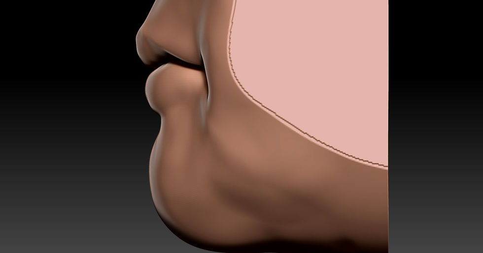
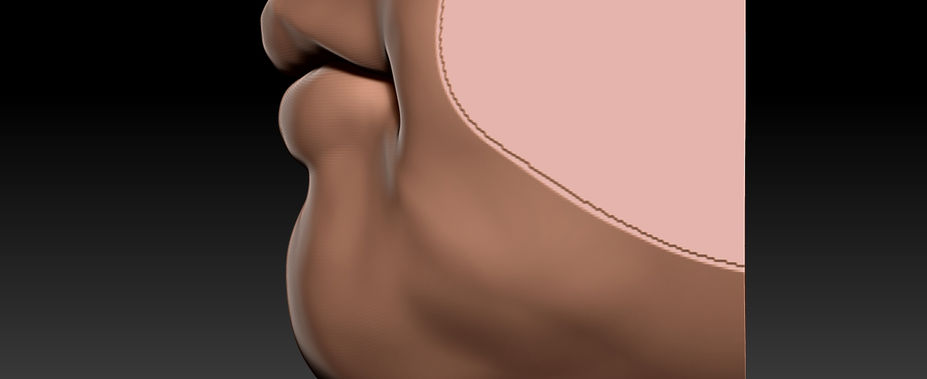
Mouth
This week we did a mouth in Zbrush, we expanded more on the tools available, such as using masking to preserve sculped areas while sculping in the vicinity of the area.
During lecture
References
After the lecture I retouched the mouth sculpt and used materials of the lecture slides as reference, as well as using google images for extra images of mouths to cross reference and add a more defined shape to the mouth.
Source:
Lecture Slides
Retouched
Ear
For this week we sculped an ear, for this I used an image in the back from one of the lecture slides to use as initial reference image.
During lecture
References
Since the one image was very limited I searched for more references, specially from different angles.
Source:
Lecture Slides
Retouched
Eye
On the 5th week we started doing the Eye feature.
We started by getting a sphere shape to use as eyeball then made a duplicate which we scaled up to make the eyelid volume.
The bigger sphere was cut in half, duplicated, the duplicate was rotated in other to cover most of the sphere that represents the eyeball, leaving a perfect ellipse exposed.
We then added a squashed sphere , merged the forms together (except the eyeball sphere) and using the clay building with the smoothing tool we added shape around to make the areas surrounding the eye.
I worked further on the eye outside of the lecture but I still think there are too many lumps to smooth.
The eye lids are too thin and need some more volume.
The eye shape still needs to be further improved.
During lecture
Retouched_1
I returned to the eye but with some reference images on a second screen to cross refence shapes.
I started by changing the eye lid thickness using the move brush with a big draw size, I then used the hPolish to reshape the lid's edges.
Afterwards using the ClayBuildup and the smooth I changed slightly the general shape of the "face" around the eye.
I also smoothed the upper lid fold entirely to redraw it with the damStandard, as well as retouched the lower eye lid.
I changed the material from the gray to the skin material. Using the Rake brush I "drew" the eyebrows and on a very low intensity I applied it on the lower and upper lids to give the lids a bit more texture.
Lastly I used the paint brush just to paint an eye on the sphere representing the eye.
References
Final
Course Activity Week
Assessment 1 Submitted Elements
All the renders for the assessment can be found in the previous weeks but I am including them here for reference.
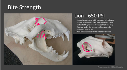
Comparative Anatomy
We looked into how animal skulls compare to human skulls, how the structure and musculature both differs and assimilates between them.
As for the workshop exercise we sculpted a skull using reference images.
I used the provided images of the female skull and kept each image open in the background while using the see through feature of ZBrush to help me give it a proportional shape.
I am working with a low resolution dynamesh as it is much effective to sculpt the general shape at lower resolutions and then slowly increase resolution for more detailed sculpting. For the time being my focus was on getting the main shape.
Source:
Lecture Slides
Neck, Cloth
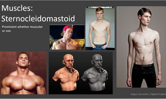
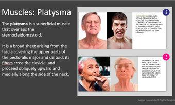
For this week we had a lecture on the structure of the neck, bones and muscle to be aware of when sculpting this area of a character.
The lecture slides provided very good references and insight on this area of the body, which I took as a reference when doing a sculpt of the neck area using zBrush's headPlane as a starting point.
References
Source:
Lecture Slides
Later during the lecture we were shown how to simulate a cloth dropping on the model.
For this we set a PolyPlane, under the dynamics pallete there is an option to run a simulation. But before running the simulation we had to change the collision settings to allow for collision.
Maya Pipeline
This week we learned how to export a zBrush model into Maya.
Firstly we opened the demon head and modified a bit, then duplicated the model, renamed it to something recognizable like "low" then using the zRemesher, under the tool palette in the Geometry category it cuts down on the polycount of the model.
Then we subdivided the model back to the roughly the same polycount it originally had.
While having both models visible, the original (high poly) and the zRemeshed (low poly), under the subtool category there is a "Project" sub category, and there we tapped "Project all" while having the low poly model active.
After having the projections finished, using the UVMaster under zPlugin palette we created the UVMap of the model, then we exported the model as an obj while it being the lowest subdivision, essentially exporting a low poly version of the model.
Back on the highest subdivision, on the zPlugin palette, under the Multi Map Exporter we can export the displacement map, the Texture from PolyPaint, making sure under the displacement map export options the Mid is set to 0.
Then on Maya, we imported the OBJ, assigned a new material, used the exported texture then assigned the exported displacement map.
Finally adjusted the displacement settings inside the Arnold sub category of the groupShape in the attribute editor and renderer using Arnold render.
Assessment 2 - Villain Development
Concept
For my villain I brainstormed some ideas.
I know I wanted to make a female character so I started by thinking what type of "role" the character has, something that would give me a rough idea of her appearance based on her "trade".
From my options I decided to go for the Barbarian Egyptian.
In my mind this character comes from an ancient Egypt setting, used to be a slave until she had enough and rebelled against her master, disposing of them.

Mind map made on Miro
While brainstorming ideas I was together with a friend, who actually drew some rough concept sketches of the character.
We had discussed that the character would be muscular and branded.
As a slave having a "brand" tattoo on their face marking them as property.
For the brand patterns we took inspiration from symbols of ancient Egyptian Mythology, Bloodborne's Hunter's Mark symbol and Lords of Salem's symbol.
Sketches by Gytis Gudavicius
I made a mood board with various elements I thought interesting for character concept.
Some of which include murals and depictions of slavery in ancient Egypt. I also included various images of Queen Nefertiti's bust and others related to her.
Also have some facial tattoo references and body references.

Sculpting the bust
Progress Screenshots 1-5
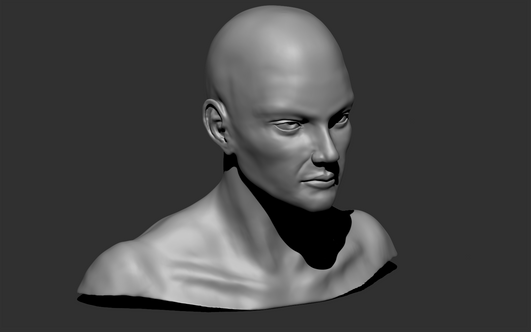
I finally hopped into zBrush to start sculping, as a base I used the "HeadPlanes_Female_128"
I started sculping as a dynaMesh to concept the main shape of the character and trying to get the main shapes of the facial elements in.
The main brushes I using during this process was the ClayBuildup, the smooth and the damStandard.
I then imported the eyes from the Female DemoHead so I could use it as a positioning reference for the eyes and kept defining her features.
The eyes underwent a lot of changes, I wasn't particularly happy with how they where looking.
Progress Screenshots 6-9
When I was struggling with an element I would google search images and use the see-through feature of zBrush to see if the proportions and general outlook of the element matched a real example.
For the muscle areas I looked up female body builders to have an idea of how the neck area should look like. I also looked into muscle maps to see were they were positioned.
Some other reference materials included a 3D sculpted head.
Other screen grabs
Reference Image Sources
Female bodyBuilder: https://qr.ae/pr2ej5
Muscles Back Torso: http://www.medicalgraphics.de/kostenlose-bilder/organe/frau-ruecken-muskel-hell.html
3D Female head: https://pin.it/32cWwNF
Ear: https://www.glamourmagazine.co.uk/article/curated-ear-trend
References
SubDivisions and Detail
After being happy enough with the current model, I changed from dynamesh to use subdivisions so I could add extra detail.I re-did the eyes and touched up the rest of the model features working in subdivisions.
I worked until subdivision 6, at over 12 million polys.
I then decided to add some finer details to the model, so created layers for these.
I added detail to the lips of the model, initially I used the ClayBuildup on intensity 1 to get the lip folds.
On another layer I added pores.
for the pores I downloaded a free set of brushes made by Rafael Souza
(https://cgelves.com/download-free-zbrush-skin-alpha-brushes-pack/?v=79cba1185463).
To have an idea of how to detail the skill, I looked into face cartography.
Daniel Boschung has on his website pictures of faces of people which can be zoomed in to look at the finer detail of their faces
Progress Screenshots 10-??
Fibermesh
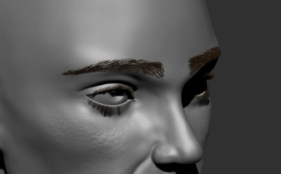
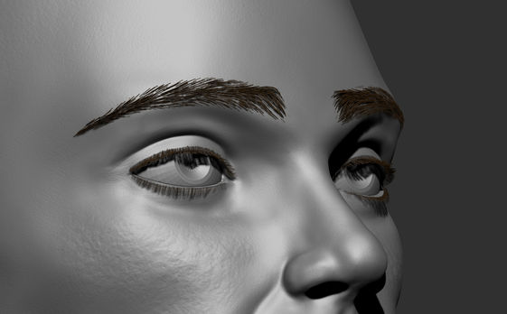
Instead of sculping the eyebrows and eyelashes I opted to use fiberMesh.
Since I was having some difficulty finding appropriate settings for the fibermesh I looked at some YouTube tutorials.
A tutorial by J Hill had a download for a fibermesh pre-set that I used and adjusted to use with my model
Tutorial Link:
Fibermesh pre-set source:
I struggled quite a lot with the grooming process, which prompted me to learn more about the brushes modifiers as the grooming brushes had very exaggerated results and was difficult to use them.
Apparently there was a setting that allows the move brush (amongst others) to preserve the length of the fibermesh, this helped a lot for the eyebrows in particular, the eyelashes were more complicated to get an appropriate shape out of.
Eyes
For the eyes I did not want to keep using the demo eyes, so added a new subtool, a sphere.
I extruded a bit as the eye's pupil comes forward. With the SubTool Master under Zplugin I mirrored the eye I had just made.
I then looked for a texture for an eye online, as for the blind eye I could not find an appropriate texture so I searched for what blind eyes look like so I could modify the texture I had downloaded and try to make it into a blind looking eye.
I saw some eyes with cataracts, which are eyes that developed cloudy patches. I wasn't sure how to make the cloudy effect so I managed to find a cataract texture and mashed the two textures together using photoshop.
After getting the textures ready I applied the textures to the Eyes subtool.
As for the material of the eyes I gave it the toy plastic material in order to get the shiny look.
Eye texture:
https://www.pinterest.co.uk/pin/162692605279185216/
Cataract image source:
https://ophtalmoveterinaire.com/en/maladies_oculaires/cataract/
Scars and earrings
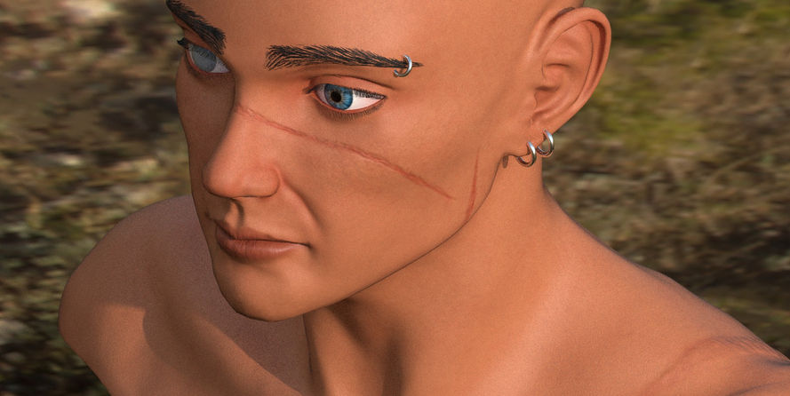
I wanted scars on my model so I searched for scar brushes, eventually purchased a pack of brushes and applied o my model.
A couple facial scars, at least one on the left side of the neck, and some on the back. As the character was supposedly a slave there is bound to have some scars from them being whipped.
As for the Earrings I just added a ring subTool, placed it and mirrored it. I also added one ring on the right eyebrow.
Scars Brushes source:
https://www.cgtrader.com/3d-models/character/anatomy/100-zbrush-scars-vdm-brush
Painting
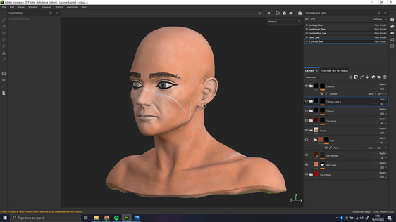
Since I was not yet very comfortable with painting in Zbrush using Polypaint I decided to do the painting of the skin in Substance Painter.
Following a tutorial, I exported a low poly version of the bust into substance painter.
I then baked the high poly texture maps into the low poly version of the model.
J Hill had another great tutorial to texture human skin, I textured my model following part of the tutorial, I did not attempt to go so deep in detail as my model was not as detailed as the one used in the tutorial.
In general the tutorial really helped me having a good insight on the process that goes into painting skin, as well as how to really utilise the black masks, layers, effects and generators in substance.
Starting with a red base and adding "noise" with another darker red colour, making some parts darker, where it "makes sense", which I utilized for my scars colour details.
Painting the "Epidermis" over the "Dermis" layer to make a more realistic skin texture.
Then I drew the tattoos and Eyeliner (not very well), I had some trouble making the tattoos look faded but I traced back and utilised the knowledge from the skin painting and adapted it into making the tattoos, by adding noise and playing around with the layer types.
Painting Progress Screenshots
Facial Dynamic Posing
I exported the textures from substance and imported them into zbrush to apply to the model.
I used the SkinShade4, I modified it a bit by reducing the specular as I did not want a shinny skin.
As the character was feeling still a bit naked sculpted a "sash" over the shoulder, I used a cube as a base, moved it around to sit around the shoulder then played around a lot with the cloth brushes/tools as well as the move brush in order to make it like a believable piece of cloth.
As for the facial expressions I picked a Disgruntled/Angry Expression and a Disgust Expression.
For the first expression, I google searched for facial expressions before settling for the Disgruntled/Angry expression.
I used layers to work on different parts of the face when making the expressions, I avoided using the smooth as it would smooth out the skin details that I had previously made on the model.
I gave it an asymmetric expression, lowered the eyebrows, raised the left cheek , made it a bit more plump, the left eyebrow I brought it out a little more and lower than the right eyebrow. Eye shape was changed to reflect these changes.
The nose has a tilt as the left side of the mouth rises.
In between the eyebrows there is some folds on the skin that I tried to sculpt as well as the folds of the nose and in the right corner of the left eye.
References
The second expression was a more symmetric expression with the exception of the folds on the forhead, the eyebrows were moved with the inner brows going up which in turn created the folds on the forehead, the outer brows being down changing the shape of the eyes. I tried to sculp the folds at the corner and around the eyes.
The nostrils of the nose also were brought up along with the folds above the corners of the mouth, the mouth was slimmed down and brought up. I made the cheeks fuller and the folds deeper after raising them up along with the mouth.
Angry face reference
https://www.pinterest.co.uk/pin/370491506831793651/
Disgust face reference
https://www.istockphoto.com/photo/facial-expressions-gm874969246-244289369


